Tuesday, December 20, 2011

Final Exam

The very first, preliminary part of the pattern before being messed with to become a scatter pattern. The background is black to see the pattern, otherwise you wouldn't be able to because it is white. 

The background pattern, which I made snow. This was made by using the one small circle and turning it into a scatter brush, randomizing everything. After that I randomly changed the circles to have different opacity, and blurs.

This is my final product of my Christmas Card for the Final Exam. The live trace for the wreath was a little time consuming, to remove the background but it turned out well. I like the snowy theme I went with, making most things shades of blue as the ideal Christmas scenery is. The tree took a large amount of time as well, and became frustrating with how jagged and awkward it looked sometimes, but I fixed it as best I could. In this project I used scatter brushes a lot, art brushes, gradients, effects such as roughen and Gaussian blur, Extrude and Bevel for 3D, live trace, type on a path, and typography. I made the holly berries and small bulbs by hand. The presents and larger ornaments were things I made in earlier tutorials. I used this tutorial for the Christmas tree shape:
http://ndesign-studio.com/tutorials/christmas-tree
This final was a little stressful with the time restriction because I usually spend large amounts of time making sure it looks just right, but I feel I did exceptionally well under the time given.

Thursday, December 15, 2011

Presents

This was probably the hardest and most time-consuming tutorial I've ever had to follow in this class. Many times certain things were left out in the tutorial so I would have to fill in the holes with what I thought would work best. It also took many times to get the boxes themselves right because one wrong move when making it 3D, including putting wrapping paper on wrong, and I would have to start over. I ended up starting completely over about 4 times. Also, some things in the tutorial were a little sloppy in which I decided to not follow exactly and embezzle my own touch on these holiday presents. Even though it was a rush to finish on the last day, I am proud of how it turned out with all the extra time I spent working on it. I even brought it to my house a few days to work on. Regardless of the difficulty, I liked to make it because of the fact that I had to do most of it on my own.

Tuesday, December 13, 2011

Yummy Strawberry

A strawberry created by following a tutorial. The hardest part would have to be the chocolate and shading, which all had to be drawn with the pencil tool. Not having a steady, or artistic, hand to create the shapes was a hindrance to making this strawberry. I had to make many sketches and outlines before having one that would work well enough. I do like how the light reflections were used to give it more of a 3D look to it. The leaves were also something new, using a leaf brush I made was fun and required a few tries as well.

Friday, December 9, 2011

Holiday Bulb

The holiday bulb as followed by the tutorial. The hardest part was getting the 3D bulb to look right, and the background pattern with gradient. Other than that it was fairly straight-forward and fun to make.
This is the same thing with my own text added at the bottom because I thought it would fit well.

Tuesday, December 6, 2011

Dirty Water

Dirty water made from a tutorial. This was a lot of fun to make, especially with how glossy and "clean" it turned out! The hardest part was all the intersecting and pathfinder tools to create the shadow and lighting effects, but they were easier once I got the hang of it. I liked using all the gradients in this tutorial because it made the drop look like it was collecting and refracting light, and I'm really happy with how it looks! Hoping for more fun tutorials like this!
This is the close up of the face as asked for by Mrs. Klein. This is to show the detail around the eyes and mouth.

Wednesday, November 30, 2011

Pattern creation in Illustrator

This pattern was created in Illustrator based on one brush. I  rotated and reflected the pattern until it looked good as one square. I then made it a swash, filled the rectangle with that swash, and scaled the pattern down.

Tuesday, November 29, 2011

Foundation Logo

Variations for the logo for Foundations, incorporating the letters CIA to stand for Character, Integrity, and Accountability.

Monday, November 21, 2011

Business Card

This is my business card for my Graphic Design business. The cubes were added on the background for a slight sense of movement, and also filler space for the card.

Monday, November 14, 2011

My Logos - Ideas

These are a few variations of ideas for my Graphic Design company logo. I'm leaning towards the one in the center, but the two on the left look appealing as well. If you have any feedback please let me know in the comments, they would be greatly appreciated in which ones you like and why.
In the end I picked this as my final logo. Reasons behind this were it's simplicity yet emphasis on architectural structure. One of the things I wanted the logo to say was how precise it was, and this is a very sturdy logo. The red also captures attention and stands out, and the logo is still legible when scaled down. Being still effective at gray scale is also a priority, which it is.

Sunday, November 13, 2011

Just For Fun: Safari Icon

In my spare time I followed a tutorial on recreating the Safari logo, because it looked cool. I really like how it turned out! The hardest part was using a triangle pattern for the tick marks around the inside to line up and be just the right number, but through trial-and-error and messing with scaling, I got them to line up perfectly!

Thursday, November 10, 2011

Extra Logo Creation - IM Icon

This is the Instant Messenger-type icon, creating in Illustrator, following a tutorial. It was pretty fun to make, and I'm happy with how they turned out! This was done while waiting to get my personal logo packet back, to give more experience in creating logos.

Thursday, November 3, 2011

Mesh Lyrics

This is my mesh artwork with lyrics based on a tutorial. The lyrics I used are from a song called Turning Tables by Adele, and I picked a font to match what the lyrics were, which was graceful and elegant. But that's all on the surface, as the font along with light blue colors of magestic-ness and peace represent, along with the smooth wave the first line is. But as it gets deeper the colors get darker, and there are more contortions and imperfections leading to the red color of anger. These lyrics are peaceful on the surface, but have a fire of bad feelings raging under the words themselves.

Tuesday, November 1, 2011

Memorable Logo Creation

This was made following a tutorial for creative logo making. The hardest part was definitely getting objects to go together with each other, and having them being hidden at certain places such as the a hiding under the z. Or getting the r to go through the o, but over the next a. It was accomplished however, through creating more things such as white objects and very heavy use of changing things around in the layers panel.

Friday, October 28, 2011

Jack O Lantern

My pumpkin created in Adobe Illustrator, to fit the current holiday!  This pumpkin turned out to be one of the hardest projects yet, with many new tools, layer manipulating, and right plain things the computer doesn't like to cooperate about. If I had to narrow it down, I must say the hardest part was the pumpkin body along with it's shading and highlights. To get them to work you had to change the opacity and blending modes of almost everything, which was troublesome when I had to put my pumpkin in front of a background, because it's blending mode was set to be semi-transparent. This was fixed by saving the pumpkin by itself as a GIF and placing the picture of it on top of another Illustrator file, the background. The background was fun to make, using a linear gradient and a return to the symbol sprayer and manipulators. I'm happy with the way it turned out, and that I was able to finish it on time!

Monday, October 24, 2011

Flower in vase

This is a flower inside a 3D-looking vase created in Adobe Illustrator. The flower itself was easy, using the pen tool and gradients. The vase was made by making half of it with the pen tool, then in effects selecting 3D rotation and adding two light sources. Then a flower symbol I created was used as a map art on the surface of the vase.

Tuesday, October 18, 2011

Personal Expression Project

My personal expression project I spent a large amount of time on.
Explanation: The type face was mainly a playful one, representing the type of person I am. This picture shows a change in my characteristics through time, with some of the basic words that describe me on the right, progressing to the more unique side of me on the left, my characteristics that set me apart more from others. The color gradient compliments this change as well, from the plain, basic, pure white to yellow, a color which represents joy and excitement. The pattern on the gradient also changes, from the normal square, into a square with rounded edges, all the way into the unique circle. The picture of me playing the trumpet and the word coming out of it is large because I feel as if it represents a big part of my life at the time. Playing music has brought out some of the great qualities I posses now.

Thursday, October 6, 2011

Type of a path

This section was all about typing on created paths. The ones of my name were changed through the Type on a Path Options,  such as effect, path alignment, flipping, and spacing. The Pillow pet one is typed on two different circle paths, created around the dolphin. My name in rainbow was distorted through creating a rectangle around it, then selecting them both for an envelope distort. I was then able to change each corner.

Wednesday, October 5, 2011

Live Trace Tutorial

This is my final product after following the Live Trace tutorial in Adobe Illustrator. This tutorial was harder than  most others before, and used lots of new tools and skills. The hardest part was probably manipulated the gradient blue circle, and the transparent boxes with in, they didn't want to cooperate part of the time. The font used in the tutorial was not on our computers either, so I used a grungy-enough text for "snowboard". The blue and green swooshes were also a little awkward-looking at the curves, but I was able to smooth them out. It was a lot of work to make, but the more work put in, the greater the outcome is!

Friday, September 30, 2011

Personal Image Trace

This is the original Harvey- Davidson sign that I decided I would trace, because I like it's design, colors, and company.

This is my final product of the sign traced. The easiest part was making the boxes in the middle, with the rectangle tool. When I started adding text, was when it got difficult. The actual text in the original sign could not be found, so I found the closest one possible, and still edited the anchors of each letter to match more closely to the original. The word "motor" started out using real letters, and manipulating the anchors to create the stretch, but could not be done on the "O"'s, which I used the pen tool to create. Every letter in "Cycles" was created through the pen tool, because that of course would make it look closest to exact, over trying to use stretched out letters. The curved shapes on top and bottom, each line was done with the pen tool, filled in, and played around with which ones go in front and behind to make it look right. As a final touch, I used a glyph for the "R" symbol in the bottom-right corner. Once again, this was a fun tutorial for me, and I feel like I've learned Image Tracing well.

Tuesday, September 27, 2011

Image Tracing Tutorial

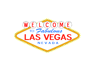
This is a shot of the original Las Vegas sign, which I have used as a template to recreate  the sign  in Adobe Illustrator.  It was set as a template then put down to 35% opacity so I could work over it.

The first step to creating this sign was the elongated diamond, which was simple just  by making a rectangle, rotating it, and stretching the points to the sides. Making the top and bottom come to a point instead of curve was done by creating points at the top and bottom, and deleting the curved points next to them. Creating the lightbulbs around it may look hard, but was actually very simple. I makde one lightbulb with an oval and black rectangle, along with a white strip with no fill under it, to help later when they go on the sign. I used the pattern brush options to make lightbulbs into a pattern, which put them on the sign simply by selecting it's outline. The words were done with the type tool, getting the right fonts, sizes, colors, and manipulating the correct kerning and leading inbetween. For the welcome sign, one sphere was made to match the size of the original, then was transformed into six copies and moved to be barely touching at the ends. "Welcome" was written then I clicked "create lines" to be able to move each letter on it's own, to be put in the center of each circle. That's basically all that was done, this was my favorite tutorial so far, and I enjoyed recreating this sign!

Friday, September 23, 2011

Quote - Revisited

This is my personal qoute, after I recieved input from my peers on how the original looked. The main problem I was told about for my first one was the size, and contrast to background, which I fixed through blog settings, and also making the fonts bigger. The next thing to fix, was over-all blandness of the quote. Originally, only "three" and "Leonardo da Vinci" were different colors, and different fonts. I decided to not only emphasize "three", but also how each type of person "sees". The first person sees automatically, so I used light blue as a color that represents tranquility, softness, understanding, and basically peace. The second type of person sees with help, so I decided green would fit, because it represents harmony, and emotional healing. Lastly, the third type of person does not see, which is why red was used, to underline hard feelings like rage, and evoke emotion in the reading. Leonardo and "three" are in purple which represents royalty, symbolizing power and nobility, which I thought would make the perfect emphasis on those two important things. The color also goes well with this cursive font, as majestic. I used the same alignment, with small adjustments such as decreasing the leading between lines slightly, becuase the feedback on the layout of the quote was well.

Tuesday, September 20, 2011

Glyph Monster

This was the original picture I will use to create my glyph monster...

This is the final glyph monster of Pikachu! I used all kinds of letters, glyphs, and symbols, with many different sizes, rotations, and reflections. This was all done in Adobe Illustrator, as a part of our Typography section in class.

Wednesday, September 14, 2011

One Word Project

This is my one word project, using the word cut. I used the knife tool and create border tools to create this effect in Adobe Illustrator!

Friday, September 9, 2011

My Typography Quote

This is a quote I found by Leonardo da Vinci, which  was meaningful to me. I used color, size and font to emphasize parts of it, such as three, and his name. The element of line is also here, with the indented edges of each sentence, your mind makes it look like a straight line is connecting them.

Thursday, September 8, 2011

Life Quote

This was our first tutorial in Graphic Design, exploring Typography in Adobe Illustrator. All this was done using the selection and type tools. Emphasized in this tutorial was how different these few words could be displayed. All from changing font, size, color, and style, this can change how people reading interpret what this quote means.

Tuesday, September 6, 2011

Pen Practice

Today in Graphic Design we practiced tracing shapes and lines with the Pen Tool in Adobe Illustrator!

Friday, August 26, 2011

10 and 3

The best way to start off anything, with my favorite University, A&M! I want to go there for College, because they're a really good school. They also have a great Marching Band, that's always fun to watch.
Balance -- Symmetrical on both sides of the field
Emphasis, color -- The green stands out from the maroon in the stands
Pattern -- With the far row of seats, the lines are in a pattern, and all slightly angled


I really like pictures of animals. The colors of this picture also look crisp and clear, with greens and browns which makes me feel energetic. It's also the perfect picture moment this photographer captured, with wings open, right about to fly away.
Movement --It feels as if the bird is about to take off, because it's wings are fully open
Color -- The bright green pops out from the neutral brown background
Pattern -- In the tail feathers and wings 

Nature can be so beautiful, and even more beautiful when it's captured on camera. I really like the lense flare coming from the sun, that makes a warm, dark red color. This cactus plant right next to the sun, is also getting just the right amount of light, but not so much that you see it's colors.
Emphasis -- lens flare emphasizes the sun, and draws your eyes towards it
Color -- The yellow sun is a feeling of happiness, and the rest are all warm colors
Proportion -- The cactus is closer, so it looks very large in comparison to the sun

Science is one of my interests, and a subject I do well in. The precise moment a volcano erupts, it can  be a beautiful sight to see, but very dangerous. I like it for that reason, that it's a great sight of nature, but at the same time a devastation force.
Movement -- The eruption makes it feel like the lava is flowing down the mountainside
Color -- Red gives off anger and passion, mixed with the yellow overwhelmingness
Emphasis -- Of course the very bright eruption brings emphasis to it


I'm not going to lie, I'm a pyromaniac! It's just so much fun for me to play with fire, matches, anything. It's also interesting how it can vary in these colors that all go together, instead the normal yellow-orange.
Space -- your eyes are drawn to the negative space, but since nothing is there go back to the fire
Colors -- all fit together, like they blend and mix in-between
Movement -- I can feel a slight flickering in the flames


Fruit is something I eat everyday I can. Pineapple is my favorite, strawberries which are also in this, come in a close second. This photogenic treat looks very tasty and appeals to my sense.
Texture -- the coarse crust seen
Rhythm, Repetition -- the bums and hills of the crust
Emphasis -- Emphasis is on the front of the picture, because the back is unfocused 


Holloween is a very fun time of year for me. It's great fun dressing up as something you're not for one night, and having random people give you candy. This picture gives the feeling of darkness and the fear Halloween can be centered around, with this angry jack-o-lantern and it's dark background.
Texture -- of the pumpkin skin, very grainy
Proportion -- There is one large pumpkin, and a few small ones
Pattern - a tile pattern is seen on the floor under the pumpkin


When I was smaller, I was obsessed with magic tricks. I bought so many sets and tricks, and would show my friends because I loved the amazement and unknowing of how I did what I did, that I could see in their faces. This black and white in this picture represents how much of a classic trick this is, the old rabbit out of hat trick!
Color -- the first thing noticed about this is the black and white, positive and negative color
Rhythm -- The background is a gradation, light at the bottom, getting darker at the top
Emphasis -- brought to the rabbit by the black of the hat, and opposite, white of the rabbit


As I said earlier, I'm interested in Science. Astronomy was one of my favorite subjects, because of the beauty of other galaxies, and stars. It's amazing that so many stars, so far away, can make these abstract forms and shapes.
Point -- With all the stars, your mind tries to connect them, and see a relationship making it look like a spiral
Shape -- The spiral is a feeling of safety
Movement -- Since it's a spiral, it almost feels as if it's spinning around 

Last, but not least, is the instrument I play, the trumpet. This pictures shows the very cleanliness and smoothness of a trumpet. The purple light mixing with the gold trumpet also sends a groovy vibe type feeling.
Texture -- to me, I can see the trumpet and image the brass, smooth feel of it
Lines -- the many horizontal lines in this picture give a feeling of rest
 Colors -- Both the yellow, happy, and the blue, coolness, combine for an even better feeling

Wednesday, August 24, 2011

About Me

I'm a 14 year old, that has 3 sisters, and 2 brothers, making things around my house a little crazy at time. Early on in my child hood I learned about something I loved to do, by my older neighbor convincing me to be a part of short videos he like to make, whether they be skits, comedy, or very frequently, our attempt at scary videos. When I was older I started making my own videos and posting them to YouTube for my friends and family to see. I loved acting, filming, directing, producing, and above everything, editing. I loved editing videos because I could have a boring, raw video, and change it into a breathtaking final product. I've tried playing around with PhotoShop before, but I wasn't as into pictures as videos, so I let the trial expire and didn't use it again. I signed up for Grpahic Design because I thought it would fun, while adding to experience to this field in my life.